Creating a professional logo doesn’t have to be expensive or time-consuming. With AI tools, you can design a logo in just one hour that grabs attention, builds trust, and boosts brand recognition. Here’s how:
- Step 1: Define Your Brand
Identify your business name, target audience, and key traits. Pick 3–5 adjectives that describe your brand’s personality (e.g., bold, approachable). Choose a visual style (e.g., classic, modern) and list design keywords (e.g., colors, icons, fonts). - Step 2: Use an AI Logo Generator
Tools like IdeaFloat’s AI Logo Generator can create tailored designs based on your inputs, offering a variety of styles and options instantly. - Step 3: Review and Refine Options
Generate multiple designs and evaluate them for clarity, readability, and alignment with your brand. Narrow down to 2–3 strong contenders. - Step 4: Edit Details
Adjust fonts, colors, and layouts to ensure a polished look. Test for scalability and versatility across different platforms. - Step 5: Test and Download
Check how your logo appears in various sizes and formats. Export it in multiple file types (e.g., PNG, SVG, PDF) for both digital and print use.
A great logo is simple, memorable, and reflects your brand’s identity. By following these steps, you’ll create a logo that resonates with your audience and supports your business goals.
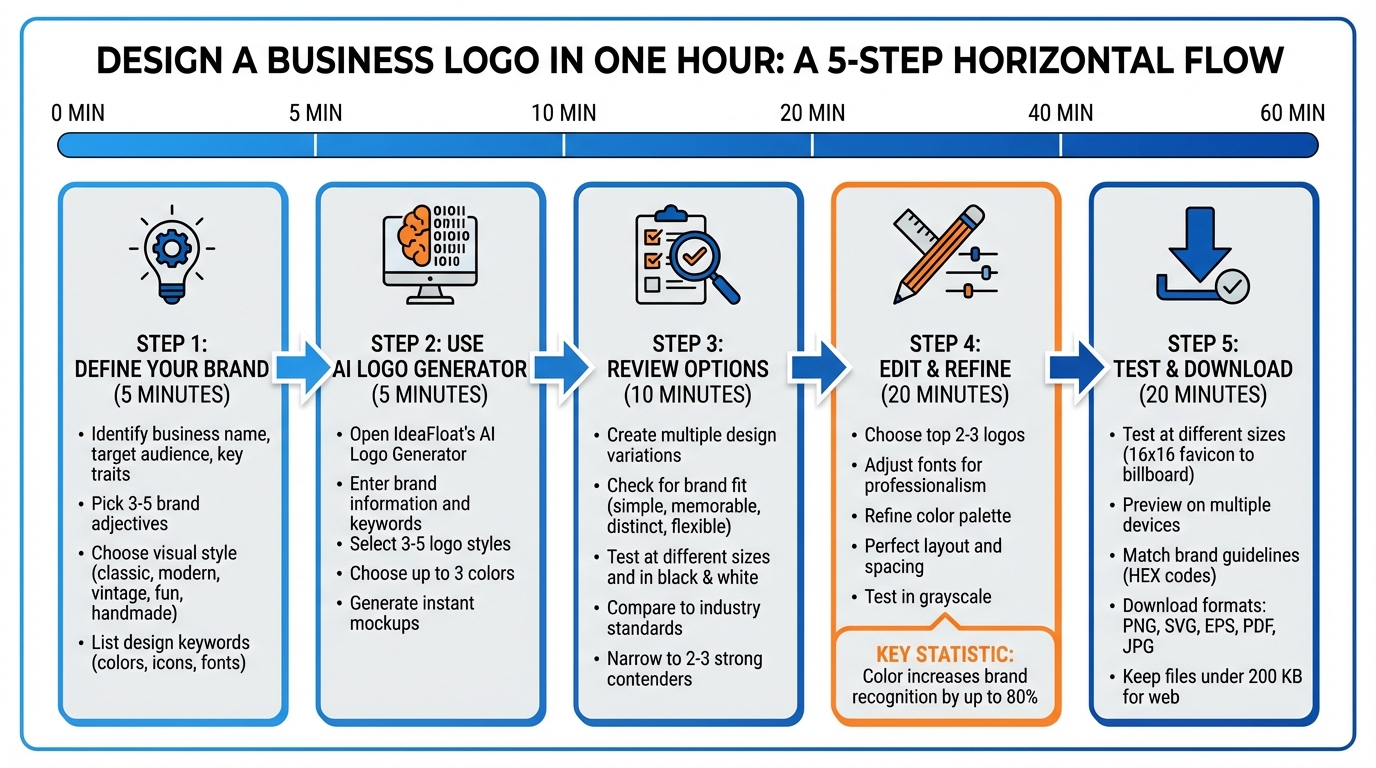
5-Step Process to Design a Professional Business Logo in One Hour
Create a Logo with AI and Canva in Seconds

Step 1: Gather Your Brand Information (5 Minutes)
Before diving into design, it's essential to clarify what your brand represents. Taking just five minutes to outline this will help ensure your logo resonates with your audience.
Write Down Your Brand Basics
Start by jotting down the essentials: your business name, the industry you operate in, the core problem your business solves, and details about your target customers. Include specifics like their age, online habits, and key challenges. For instance, a sustainable skincare brand aimed at Gen Z might focus on values like transparency and eco-friendly packaging.
Then, choose 3–5 adjectives that define your brand's personality. Are you bold and innovative? Friendly and approachable? Or perhaps sophisticated and elegant? These words will shape your design decisions, from the font to the color palette. For example, a law firm might lean toward adjectives like "trustworthy, professional, established", while a children's party planning service might go for "playful, energetic, colorful."
"The best branding connects to the most specific target market possible - not everyone. A highly focused visual directed at that target will connect the brand to the audience."
– Kyle Golding, CEO & Chief Strategic Idealist, The Golding Group
Once you’ve outlined your brand basics, it’s time to think about a visual style that reflects your identity.
Pick Your Visual Style
Your visual style should align with your brand’s personality while fitting within your industry’s context. Did you know that color can increase brand recognition by up to 80%? That’s why choosing an aesthetic that matches your brand identity is so important. Think about these styles:
- Classic: Timeless and professional.
- Modern: Minimalist with clean lines.
- Vintage: Nostalgic with a touch of worn textures.
- Fun: Quirky and colorful.
- Handmade: Organic and artisanal.
Take a look at 3–5 competitors to see common styles in your industry. Decide whether you want to blend in or stand out. As Kenneth Burke, Marketing Director at Text Request, explains:
"The biggest question I ask myself when critiquing logos is 'What's the competition doing?' A lot of research goes into logo design, and your competitors have already gone through the process."
Create a List of Design Keywords
Now, list 3–5 keywords that describe your design vision in three areas: colors, icons, and fonts. Be specific. For colors, instead of just saying "blue", clarify whether it’s "navy blue" or "sky blue." For icons, decide if you prefer "geometric" or "organic." For fonts, think about whether "bold sans-serif" or "elegant script" fits your brand better. These keywords will help AI design tools produce more accurate results.
Also, consider where your logo will appear most often - social media profiles, business cards, physical signage, or even tiny favicons. For instance, a coffee shop might use keywords like "warm brown, coffee bean icon, friendly rounded font", while a tech startup might go with "electric blue, circuit pattern, modern geometric font." Keep it simple if your logo needs to scale down without losing clarity.
Step 2: Use IdeaFloat's AI Logo Generator (5 Minutes)
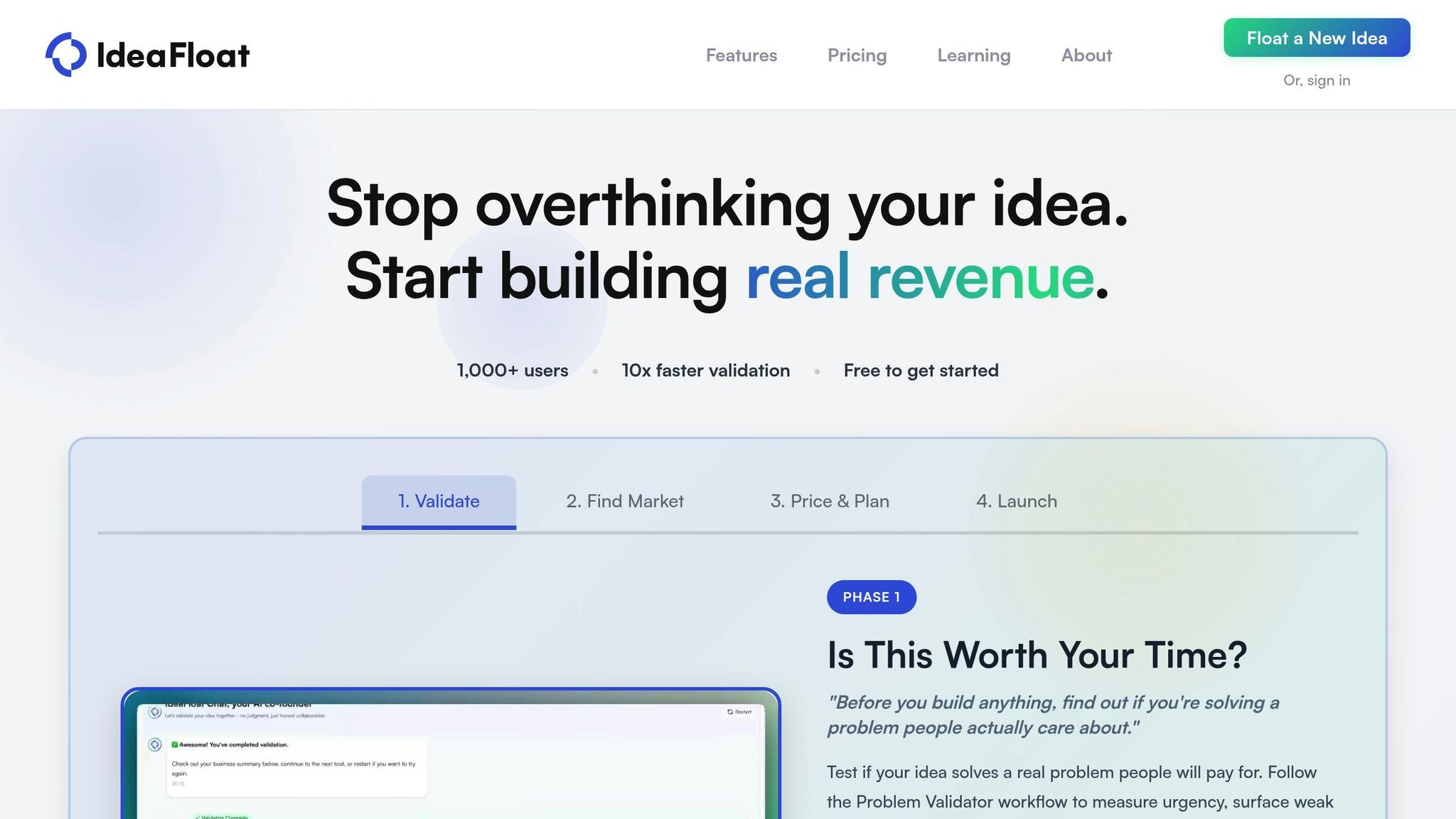
Once you've nailed down your brand basics in Step 1, it's time to bring your vision to life with IdeaFloat's AI Logo Generator. This tool makes it easy to create professional logos in just a few minutes.
Open the Logo Generator
Log in to your IdeaFloat account and head over to Phase 4: Time to Get Customers. Here, you'll find the Logo Generator, along with other tools designed to help you launch your brand. Click on the Logo Generator to get started. The platform is user-friendly and perfect, even if you're not a design expert.
Enter Your Brand Information
Start by entering your business name and industry. This helps the AI understand your field and pick symbols that match your niche. Then, add specific keywords like "navy blue", "geometric icon", or "bold sans-serif" to give the AI a clear sense of your design preferences.
Next, select 3–5 logo styles that match your brand's vibe - whether you're going for a minimal, classic, or modern look. You'll also choose up to three colors that represent your brand's personality. With this detailed input, the AI generates tailored logo mockups instantly. As you review and select your favorites, the AI adjusts and fine-tunes the designs, delivering hundreds of mockups for you to explore.
Step 3: Create and Review Logo Options (10 Minutes)
Create Multiple Logo Designs
Using IdeaFloat's AI, you can instantly generate a wide range of logo designs. Don’t just stick to the first set - explore multiple variations to see how the tool interprets your inputs. It automatically creates designs with different fonts, color combinations, and icon placements, saving you the hassle of starting from scratch.
Pay close attention to how these layouts influence readability. Some designs emphasize your business name by placing it front and center, with the icon as a subtle accent. Others might highlight the symbol, making it the focal point. Always prioritize clarity - your business name should stand out. Once you’ve explored the options, move on to evaluating how well each design aligns with your brand.
Check for Brand Fit
Next, assess which designs truly resonate with your brand. A strong logo should be simple, memorable, distinct, flexible, and suitable for your industry. Consider the emotions each design conveys and select the ones that clearly reflect your brand’s identity. This quick review is key.
Put your top choices to the test by checking how they look at different sizes and in black and white. Make sure your final picks align with the brand fundamentals you outlined earlier. As Pierpaolo Chiaravalloti, Head of Branding at Desircle, says:
"A logo is 'great' when it works. Those characteristics are memorable, recognizable, and functional to the project".
Finally, compare your shortlisted designs to what’s common in your industry. Your logo should feel relevant to your field while also standing out. If competitors are all using similar shapes or colors, think about whether breaking away from the norm could help your brand stand out. Once you’ve refined your shortlist, you’re ready to move on to editing and perfecting your logo.
sbb-itb-08dd11e
Step 4: Edit and Refine Your Logo (20 Minutes)
Choose Your Top 2-3 Logos
Start by narrowing your choices down to two or three designs that best capture your brand's identity. Look for logos that are clear, memorable, and resonate with your audience across different platforms. Each design should instantly convey your brand's message - ideally within 15 seconds. If a logo feels cluttered or unclear, it's time to let it go.
Once you've identified your finalists, focus on refining them to ensure they fully represent your brand.
Adjust Fonts, Colors, and Layout
Now that you've chosen your top contenders, it's time to fine-tune the details to create a polished, professional logo that aligns with your brand.
Start with typography. The font you choose should reflect your brand's personality. As Erik Pitzer, a graphic designer at Illumine8 Marketing & PR, puts it:
"Unique typography in logo design is the simplest way to look professional".
Next, refine your color palette. Did you know that color can boost brand recognition by up to 80%? Different colors evoke different emotions: blue conveys trust and professionalism, red symbolizes passion and energy, green connects to nature and health, and yellow radiates joy and positivity. Use tools like IdeaFloat to tweak your palette, whether by entering HEX codes or exploring complementary colors.
Finally, focus on your layout and spacing. Proper spacing ensures your logo is easy to read and visually balanced. Experiment with different arrangements and make sure the design works in grayscale. To establish a clear visual hierarchy, make your company name larger and bolder than your slogan. Whether your logo appears on a business card or a billboard, it should always look sharp and professional.
Step 5: Test and Download Your Logo (20 Minutes)
Test Your Logo at Different Sizes
Your logo needs to look sharp and clear, whether it's a tiny 16×16 pixel favicon or displayed on a massive billboard. Start by shrinking it to 10–20% of its original size and preview how it appears on smartphones, tablets, and desktops. Check that the text stays readable and the symbol remains distinct. If the details blur or the design feels too busy, simplify it. Christine Lieu, Founder of CL Designs, highlights the importance of scalability:
"Ensure your logo is a vector of the highest resolution quality and is able to scale and be easily identifiable and memorable."
Use digital mockups to see how your logo looks on business cards, T-shirts, and signage. It’s also a good idea to test it in all-black and all-white versions to ensure it works against different backgrounds. For digital use, stick to 72 PPI, and for print, aim for 300 DPI. Once you’ve confirmed your logo’s scalability and clarity, align it with your brand’s overall guidelines.
Match Your Brand Guidelines
Make sure your final logo follows your brand’s established colors, fonts, and style. Use exact HEX codes for digital applications and convert those colors to CMYK for printing. Double-check that the typography and visual hierarchy highlight your company name effectively.
Download in Multiple Formats
Export your logo in both vector and raster formats to cover all possible uses. Vector files like SVG, EPS, and PDF are ideal for scaling without losing quality, whether for business cards or billboards. Raster files, such as PNG and JPG, are better suited for digital platforms. PNG is particularly useful for websites and social media because it supports transparent backgrounds.
Here’s a handy reference:
| Format | Type | Best Use Case | Supports Transparency |
|---|---|---|---|
| PNG | Raster | Websites, social media, email signatures | Yes |
| SVG | Vector | Responsive websites, icons, digital illustrations | Yes |
| EPS | Vector | Professional printing, large-scale signage | Yes |
| Both | Sharing designs, digital printing, brand guides | Yes | |
| JPG | Raster | Social media profile photos, simple web images | No |
Always save your master file first, typically in AI or EPS format, and then generate other formats from it. For online use, keep your logo files under 200 KB to ensure faster loading speeds. When using PNG files, opt for a transparent background to avoid awkward white boxes on colored or image-based backgrounds.
Conclusion
In just one hour, you’ve created a professional logo - from shaping your brand’s identity to downloading the final design files. The secret lies in starting with solid research: understanding your target audience, defining your brand’s key traits, and analyzing your competition before diving into the design process. As Kyle Golding, CEO & Chief Strategic Idealist at The Golding Group, explains:
"The best branding connects to the most specific target market possible - not everyone. A highly focused visual directed at that target will connect the brand to the audience."
Let’s revisit the essentials of an effective logo. First impressions carry weight, so ensure your logo works across different sizes and looks sharp in black and white. Always secure vector files like SVG, EPS, or PDF for scalability. A carefully chosen color palette is another hallmark of a versatile and impactful logo.
Think of your logo as the visual representation of your brand’s promise. By following these steps, you’re creating a design that communicates your brand’s value clearly and effectively. Your brand deserves nothing less than a logo that resonates and delivers.
Ready to bring your vision to life? Use IdeaFloat's AI Logo Generator to craft a brand identity that truly connects.
FAQs
How do I create a logo that reflects my brand's personality?
To create a logo that genuinely reflects your brand, start by defining your brand’s personality. Think of 3–5 adjectives that capture how you want your business to come across - like friendly, bold, or reliable. These words should align with your brand’s core values and long-term goals, giving you a clear direction for your design.
From there, focus on colors and fonts that match the personality you’re aiming for. For instance, vibrant reds can evoke energy and passion, while soft blues can convey calmness and trust. When it comes to fonts, a modern sans-serif can give your logo a clean, polished feel, while a playful script might suit a more relaxed, approachable brand.
Once you’ve got a design, put it to the test. Share it with your target audience to see if it communicates the message you’re going for. Use their feedback to fine-tune the design, ensuring the final logo resonates with your customers and reinforces your brand’s identity.
What are the advantages of using an AI-powered logo maker?
AI-driven logo creators make it simple to design polished, standout logos in no time. These platforms offer a range of design styles, flexible customization features, and pre-made assets like color schemes and mockups - all without the cost or time commitment of hiring a designer.
They’re a great option for creating logos that reflect your brand’s personality while connecting with your audience. On top of that, you’ll get royalty-free files in scalable formats, ensuring your logo looks sharp whether it’s on a website, social media, or printed materials.
How can I make sure my logo works well in different sizes and formats?
To make sure your logo looks sharp and professional across different platforms and sizes, always save it as a vector file (like SVG or EPS). These formats allow your logo to be resized without any loss in quality. From there, test it by exporting in key sizes - such as 16×16 px, 128×128 px, and up to 1024×1024 px - to ensure it stays clear and legible whether it’s tiny or large.
For physical tests, print your logo on items like a business card (3.5 in × 2 in) and a poster (24 in × 36 in) to check its sharpness and balance. Be sure to test it on both light and dark backgrounds, and create single-color as well as black-and-white versions to confirm its flexibility. Lastly, preview how the logo appears in everyday uses, such as website headers, social media profile images, and product labels. Pay special attention to its readability at small sizes, like a favicon (40×40 px). These steps will help ensure your logo maintains a polished and consistent appearance everywhere it’s used.
Related Blog Posts
- How to Create a Compelling Business Plan in 24 Hours
- How IdeaFloat can save you time by building your business plan
- IdeaFloat Just Saved Me 40 Hours of Business Planning (Here's How)
- Idea to Identity: Name + Logo in 60 Minutes (Positioning-First Method)