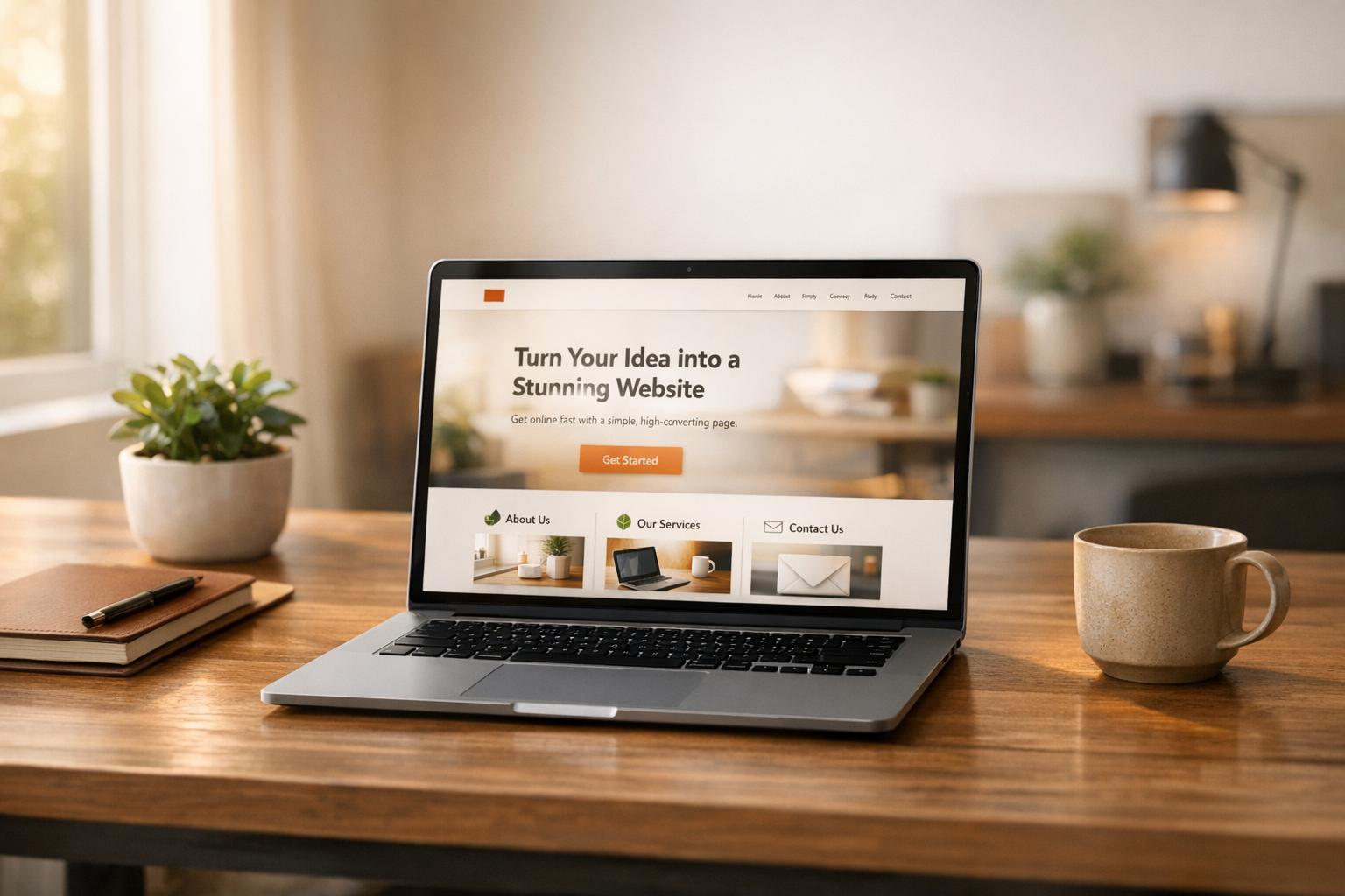
In a world where attention spans are shrinking, a single-page website can be your fastest route to validating a business idea - no social media required. Why? It’s simple, focused, and built to convert. Unlike traditional multi-page sites, these one-pagers guide visitors toward one action: signing up, purchasing, or joining a waitlist.
Here’s the game plan:
- Speed matters: A 1-second delay in load time can cut conversions by 7%. One-page sites load faster and work better on mobile (which drives 77% of retail traffic).
- Keep it simple: Stick to one offer, one goal, and one clear message to avoid overwhelming visitors.
- Structure is key: Use 7 sections - hero, problem, solution, social proof, pricing, objections, and a strong call-to-action.
- Skip social media: Focus on high-intent traffic sources like search ads, email outreach, or SEO.
With this approach, you can test your idea, gather feedback, and even make your first sale - all without wasting time or money on unnecessary distractions. Let’s break it down step by step.
Copy This SIMPLE Landing Page to 3x Your Sales (Super Easy!)
Set Your Offer and Validation Target
Before diving into copywriting or design, ask yourself two key questions: What action do I want visitors to take? and How many responses will prove my idea works? Without clear answers, you're essentially building in the dark.
The most effective single-page sites stick to "The Rule of One": one reader, one idea, one promise, and one offer. Need proof? In 2013, Whirlpool simplified their approach by reducing four calls-to-action to just one. The result? A 42% increase in email click-through rates. Offering too many choices doesn't empower visitors - it overwhelms them.
Set a clear, measurable goal. For example, aim for 25 email signups in two weeks, 10 pre-orders at $29/month, or 50 downloads of a lead magnet. With the average landing page conversion rate sitting at 6.6%, a 25% conversion rate for low-effort actions or over 10% for early-access signups can indicate you're on the right track. Once your target is set, craft an offer that speaks directly to your audience's needs and desires.
Think about what your audience values most. Whether it's a beta invite, a consultation, or a pre-order, make sure your offer addresses a specific problem. Tools like IdeaFloat's Problem Validator can help confirm if people are willing to pay for a solution. Then, dive into Consumer Insights to see how they naturally talk about their frustrations online. Joel Klettke, for example, pulled the phrase "If you think you need rehab, you do" from an Amazon review. Using this exact wording, he boosted button clicks by 400%.
"The success of your landing page is 98% about the offer. Make it as good as possible. Make it about the user. Forget 10% off. Real value. Work on your offer more than anything." – Peep Laja, Founder of ConversionXL
To make your offer irresistible, use IdeaFloat's Consumer Insights to dig through forums and reviews. Pay attention to the exact words customers use to describe their pain points and copy them directly into your messaging. When your headline mirrors the thoughts already running through their minds, they’ll stop scrolling - and start converting.
Build Your Page Layout
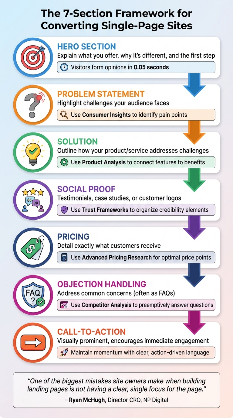
7-Section Single-Page Website Structure for Maximum Conversions
Once you’ve defined your offer and set clear goals, it’s time to design a page that guides visitors seamlessly from curiosity to action. A single-page site can act as a powerhouse for conversions, steering users toward one specific goal. Remember, visitors form an opinion about your site in just 0.05 seconds, so every section needs to justify its presence. The objective is straightforward: keep visitors engaged and drive them to act.
The 7 Sections You Need
Your page should follow a logical structure that aligns with how people make decisions. Start with the hero section, which acts as the gateway. This is where you quickly explain what you offer, why it’s different, and how visitors can take the first step. Next, dive into the problem statement, where you highlight the challenges your audience faces. This instantly shows that you understand their needs and frustrations.
Once you’ve captured their attention, introduce your solution by outlining how your product or service addresses those challenges. Build trust next with social proof - this could be testimonials, case studies, or logos of well-known customers that demonstrate others have benefited from what you offer. Follow this with a clear pricing section to remove uncertainty by detailing exactly what customers will receive. Add an objection handling section, often formatted as FAQs, to tackle common concerns and eliminate any remaining doubts. Finally, wrap it all up with a strong call-to-action that visually stands out and encourages immediate engagement.
"One of the biggest mistakes site owners make when building landing pages is not having a clear, single focus for the page. Landing pages should have one primary objective." – Ryan McHugh, Director, CRO, NP Digital
Now, with IdeaFloat’s tools, you can refine each of these sections to perfection.
Match IdeaFloat Tools to Each Section

No need to start from scratch - IdeaFloat offers tools to help you craft every part of your page. For the hero section, the Unique Value Proposition tool generates headlines and subheaders that clearly communicate what you’re offering and why it matters. When working on the problem statement, use Consumer Insights to identify and articulate your audience’s pain points. In the solution section, leverage Product Analysis outputs to connect features to benefits, focusing on how they make a difference rather than just listing technical specs.
For social proof, Trust Frameworks can help you organize testimonials or customer logos to create a sense of credibility and urgency. The pricing section benefits from Advanced Pricing Research, which identifies the ideal price point and suggests strategies like strikethrough pricing or limited-time offers to emphasize value. For objection handling, Competitor Analysis helps you address customer concerns by preemptively answering common questions. Finally, ensure your call-to-action maintains the momentum set by the hero section with clear, action-driven language.
Next, let’s compare this streamlined single-page approach to traditional multi-page websites.
1-Page vs. Multi-Page Sites
Single-page websites are all about focus and speed, while multi-page sites cater to users who want to explore. Here’s a quick comparison, especially for early-stage businesses:
| Feature | Single-Page Website | Multi-Page Website |
|---|---|---|
| Primary Goal | Conversion (sign-ups, sales) | Information and exploration |
| Navigation | Minimal (anchor links only) | Full menu (Home, About, Services, Blog) |
| Time to Launch | Minutes to hours | Weeks to months |
| Distractions | Low (focused on one offer) | High (multiple links and exit points) |
| Validation Suitability | High (quick feedback on a specific idea) | Low (harder to isolate variables) |
| Cost | Low (often uses no-code builders) | High (requires design and development) |
Understanding these differences can help you decide which approach works best for your goals and resources. Single-page sites are ideal for testing ideas quickly, while multi-page sites are better suited for businesses with broader offerings or complex user journeys.
sbb-itb-08dd11e
Write Copy That Gets Conversions
With your streamlined page layout ready, the next step is making sure every word on the page works toward one goal: driving conversions. Your copy should be clear, focused on benefits, and easy to absorb. Visitors typically decide within 10–20 seconds whether to stay or leave. Every sentence should pull its weight, quickly communicating value and removing any hesitation. Let’s start with the most important part - your headline.
Write Your Headline and Hero Text
Your headline is the first thing visitors notice, and it should immediately communicate your value. Use the "Rule of One": focus on one reader, one clear idea, and one specific action. This keeps your message sharp and avoids confusion. Tools like IdeaFloat's Unique Value Proposition generator can help you create 20+ headline variations from a simple draft. Pick the one that resonates the most.
A great headline also follows the 4-U Formula: it’s Useful (solves a problem), Unique (stands out from competitors), Urgent (encourages immediate action), and Ultra-specific (clearly states benefits). For example, instead of a generic "AI-Powered Marketing Automation", try "Save 10+ Hours a Week with AI Automation" to highlight exactly what your audience gains.
IdeaFloat's Consumer Insights can be a game-changer here. Analyze customer reviews to find the exact words your audience uses to describe their challenges and goals.
"The landing page MUST use the same words as the ad or email that lured them in. If that chain of language is broken, expect a high bounce rate." – Andy Crestodina, Chief Marketing Officer, Orbit Media
Create Benefit Bullets and Handle Objections
Once your headline grabs attention, use benefit bullets to clearly outline what visitors will gain. Focus on outcomes, not just features. Instead of saying, "Integrates with 50+ tools", explain the result: "Sync HubSpot and Slack without writing code." This approach shows visitors how your product directly helps them.
Keep your bullet points short, scannable, and action-driven. Start with verbs like "Get", "Save", or "Build." Test multiple versions using AI tools to find the phrasing that resonates most with your audience. For example, DCfinder SEO Tool saw a 68% increase in conversions in 2025 by shifting their message from "Pinpoint and Eliminate Duplicate Content" to "Avoid Losing Rankings, Traffic, and Money". The key? Clear, benefit-focused language that aligns with your page’s main goal.
Address potential objections right away. If visitors pause at your pricing table, add elements like testimonials or a money-back guarantee nearby. Use IdeaFloat's Competitor Analysis to uncover common concerns and preemptively address them in an FAQ section. For instance, in 2024, BusinessSuites Office Space revamped their page to emphasize a customer promise - "an office I can move into right away" - and saw an 88% boost in conversions while cutting cost-per-action by 45%.
"Your visitors don't care about features, really - they care about the benefits your features provide." – Unbounce Guide
Write Pricing Copy That Sells
Your pricing copy should be both transparent and persuasive. One effective strategy is price anchoring: list the highest-priced plan first to make other options feel more affordable. Research shows that when options are presented left to right, starting with the most expensive, people are more likely to choose pricier packages.
Present your pricing clearly in USD and tie it to benefits. Instead of "Essential Plan – $20/month", say "Solo Plan – Everything you need to launch – $20/month." This approach helps visitors quickly identify the plan that suits their needs.
Reduce perceived risk by offering free trials or money-back guarantees. In 2025, Bidsketch introduced segmented plan names like "Team" and "Solo", making it easier for customers to self-select. This simple change led to a significant increase in monthly revenue and higher average revenue per user. Adding an FAQ section near your pricing tiers can also address common billing concerns and ease hesitation.
3 Headline Styles Compared
Different headline styles appeal to audiences in different ways. Here’s a quick breakdown to help you choose the best fit:
| Headline Style | Focus | Best For |
|---|---|---|
| Problem-First | Highlights a key pain point | Solution-aware audiences seeking empathy |
| Outcome-First | Emphasizes the results or benefits | Product-aware audiences looking for clear value |
| Audience-First | Speaks directly to a specific persona | Targeted campaigns for niche segments |
Choose the style that matches where your audience is in their journey. If they’re just beginning to recognize a problem, start with empathy. If they’re comparing solutions, focus on the outcomes they can achieve.
Get Traffic Without Social Media
Once you have your high-converting page ready to go, the next big step is bringing in quality traffic. And guess what? Social media doesn’t have to be your go-to. For many new businesses, it’s not even the best choice. Instead, channels like search ads, email outreach, or niche communities can connect you with visitors who are already interested in what you offer. The secret? Start with one channel, test it thoroughly, and adjust based on real data.
Start with One Traffic Source
Pick one traffic source and stick with it for at least two weeks. Why? Focusing on just one prevents your data from getting muddled. For example, if you’re testing a new product, Google Ads can instantly drive targeted traffic by putting your page in front of people actively searching for solutions like yours. A great example of this is Wise (formerly TransferWise). They created a landing page targeting the keyword “Bank of America routing number,” which now brings in 34,900 monthly search visits by including the routing number and a cost comparison.
If paid ads feel out of reach budget-wise, consider email outreach or building backlinks. Securing backlinks from “best of” lists or niche resource pages can be a game-changer. Take Asana’s “task management” landing page - it targets high-intent keywords and generates about 13,500 organic visits a month by focusing on benefits like collaboration and progress tracking.
"The landing page MUST use the same words as the ad or email that lured them in. If that chain of language is broken, expect a high bounce rate." – Andy Crestodina, Co-Founder, Orbit Media
The key is to pick a channel and refine it. Once you’ve made your choice, tracking its performance is essential.
Monitor Results and Adjust
When traffic starts coming in, keep a close eye on your conversion rate. This metric - how many visitors take action (like signing up or making a purchase) compared to the total number of visitors - will tell you if your traffic source is paying off. On average, landing pages across all industries see a conversion rate of 6.6%, but this varies. For example, ecommerce averages 4.2%, while entertainment can hit 12.3%. If your rate is falling short of your industry’s benchmark, focus on testing one major element, like your headline or offer, rather than small tweaks.
Don’t forget to use UTM parameters in your URLs. These handy tags help you pinpoint which channel is driving the most conversions. For instance, if you’re running Google Ads and email campaigns at the same time, UTM tags can reveal which one is pulling its weight. Let your tests run for at least two weeks to account for natural fluctuations like weekends or holidays before making any decisions. Here’s a success story: BusinessSuites, an office space provider in Austin, Texas, revamped their landing page by shifting the focus from company features to a clear promise - “an office I can move into right away.” The result? An 88% jump in conversions and a 45% drop in cost-per-action.
Weigh Your Non-Social Traffic Options
Not all traffic sources are created equal. Here’s a quick look at the pros and cons to help you choose the best fit for your goals:
| Traffic Source | Cost | Learning Curve | Targeting Accuracy |
|---|---|---|---|
| Search Ads (PPC) | High (Pay-per-click) | Moderate/High | Very High (Keyword-based) |
| SEO (Organic) | Low (Time-intensive) | High | High (Intent-based) |
| Email Outreach | Low/Moderate | Moderate | High (List-based) |
| Niche Communities | Low | Low | Moderate to High (Context-based) |
Search ads get you quick results but come with costs and require some know-how around keywords. SEO is a slower burn - it’s cheaper but takes time to gain traction. When going this route, focus on transactional keywords where Google already shows landing pages instead of blog posts. Email outreach can work wonders if you’ve got a subscriber list or can build one through partnerships. Lastly, niche communities like Reddit, Slack groups, or industry-specific forums offer affordable access to engaged audiences. Just keep in mind that you may need to contribute value to these communities before promoting your page.
The best channel for you depends on your budget, timeline, and where your audience hangs out most.
Test Your Idea and Launch
You've worked through the essentials: defining a clear offer, designing your page layout, crafting persuasive copy, and driving traffic without relying on social media. Now comes the exciting part - bringing it all together and gathering real feedback from potential customers. A one-page site is your quickest route to validation because it forces you to keep things simple: one goal, one message, and one action. No distractions, no unnecessary pages.
The key advantage here is speed. With a no-code builder, you can have your validation page live in under 30 minutes. Set a clear target - like 25 pre-sales or 100 email signups - to determine if your idea has traction. If you hit your goal, you've proven there's demand. If not, you can tweak your messaging or pivot entirely without wasting months or sinking a ton of money into the project.
"Speed is your secret weapon. Every day you spend tweaking a website is a day you're not selling." - ClickFunnels
Once you've tested the waters, platforms like IdeaFloat take things up a notch. They streamline the entire process, automating the technical setup and offering AI-powered tools to help you build your page, write copy, and plan your launch. Instead of juggling multiple tools for hosting, design, and analytics, you get everything in one place. From your Waitlist Landing Page to a Community Launch Map complete with ready-to-post content, it's all handled for you. Hosting and technical configurations are automated, so you can focus entirely on refining your offer instead of troubleshooting.
As your launch unfolds, keep an eye on your conversion rate. If your sign-up rate exceeds 10%, it's a strong indicator of market interest. On the other hand, if you're below 5%, it's time to revisit your headline, offer, or traffic strategy. Remember, the goal here isn't perfection - it's proof. With a one-page site, you can get that proof faster than almost any other approach.
FAQs
How can I attract visitors to my one-page site without using social media?
Driving traffic to your one-page site without leaning on social media? Totally doable. Start by focusing on search engine optimization (SEO). Make sure your site has a clear, keyword-focused headline, snappy content that highlights benefits, and a compelling call-to-action. Sprinkle relevant keywords naturally into your headings, meta descriptions, and even image alt text to help your page stand out in search results. Another smart move? Write a guest article for a blog or website in your niche. Not only does this build backlinks (great for SEO), but it can also send referral traffic your way.
You can also explore paid search ads to get quick results. Even a modest budget - say, $10 a day on Google Ads - can make a big difference, especially if you're targeting high-intent keywords. And don’t forget about email marketing. If you’ve got an email list, use it! Send tailored emails that address your audience's needs, show how your site solves their problems, and include a direct link. No list? Create an opt-in funnel to grow one. Lastly, think about teaming up with complementary businesses. Offer something valuable, like a free resource or a discount, in exchange for a mention in their newsletter or podcast. It’s a great way to attract the right audience without touching social media.
What are the essential elements of a high-converting single-page website?
A single-page website designed to convert visitors should lead them smoothly toward a specific action. The layout and content need to flow naturally, keeping users engaged while guiding them step by step. Here are the key elements to include:
- Attention-Grabbing Intro: Start strong with a bold headline, a clear value proposition, and a striking visual that pulls visitors in right away. First impressions matter.
- Benefits Overview: Use concise text or bullet points to highlight how your solution addresses a problem and delivers value. Keep it focused and relevant.
- Social Proof: Build trust by showcasing testimonials, case studies, or well-known client logos. People feel more confident when they see others benefiting from your offering.
- Clear Call-to-Action (CTA): Make the next step obvious with a single, easy-to-spot CTA like “Sign Up” or “Get Started.” Pair it with a simple form or button to remove any friction.
- Additional Details: Provide supporting information like features, FAQs, or guarantees to address potential questions or concerns and reassure visitors.
By keeping your design clean and free of unnecessary distractions, your site can efficiently guide users to take action - even without relying on traffic from social media.
How can I set a clear and measurable goal to validate my business idea using a one-page website?
To test your business idea using a one-page website, start by setting a clear and measurable goal. For instance, you might aim to gather 500 qualified email leads or hit a 10% conversion rate within 30 days. These benchmarks give you a tangible way to assess interest and demand.
Concentrate on metrics that match your business goals - whether it's collecting leads, securing sign-ups, or driving pre-orders. Keep your timeline achievable and track your results closely to see if your idea connects with your target audience.
Related Blog Posts
- IdeaFloat: The 15-Minute Business Plan Solution
- The $50 Marketing Strategy That Outperformed My $5000 Campaign
- The 'Zero-Budget Marketing Plan' That Got My First 100 Customers
- How to Build a Business Like Amazon (Without Burning Millions)